Coloured pencil portraits warm and cool palette

4 min read

In the third instalment of his series exploring colou
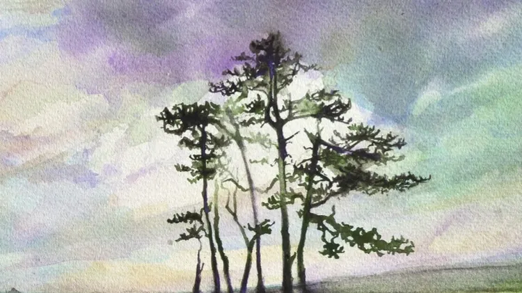
r pencil portraits, we’ll be looking at JAKE SPICER’S two-colour warm and cool palette

WORKSHOP 3

The notion of colour temperature is both instinctual and cultural, developing from our experiences of red-hot metal and blue glacial ice. While the primary red and blue on our hot and cold taps belong to unequivocally opposing categories of colour temperature, other colours in the spectrum hold more ambiguous positions. Attempts to bisect the colour wheel and separate it into objectively warm colours and cool colours ultimately fail because warm and cool should be seen as relative directions around the wheel, not a fundamental property of a colour.

If we treat orange-red as our warmest colour and cyan-blue as our coolest then we can describe the temperature of a colour by its proximity to those poles, so we can say that purple is cooler than red because it sits closer to cyan-blue and yellow is warmer than green because it sits nearer orange-red. By the same token, we could even describe a purple-red as cooler than a primary red.

When we’re drawing a face, the warmth of skin often takes precedence in our colour choices, with pinks, browns, oranges and yellows dominating skin-colour palettes and the subtle greys, greens and blues being easily overlooked. The simple palette in this article will help you to recognise cooler colours in the face more easily, catalysing a greater sensitivity to them which can be transferred to drawings made in a conventional colour combination. ▸

Water soluble media

If you’re an inexperienced watercolourist like me, then water-soluble coloured pencils are an accessible gateway to painting, allowing you to lean on the crutch of drawn marks before committing to the liquid flow of paint. In this portrait, I’ll be using Derwent Watercolour pencils – they are sufficiently pigmented to create vibrant colour on the page while having firm enough points for the precise marks that I’ll be making in the later stages of the drawing. The paper is important. I’m using a white, 300gsm hot press watercolour paper for this drawing; it is smooth enough not to interrupt the drawn marks but heavy enough not to buckle when the water is added.

Step-by-step portraıt

1 TONAL SHAPES

Start with a loose and energetic establishing sketch, pinning down the major tonal shapes of the face in blue. The water-soluble pencil is tricky to erase so keep the marks light, aiming for clearly observed shapes and emphasising important contours, while lightly noting the more ambiguous borders of shadow shap