House Beautiful - UK
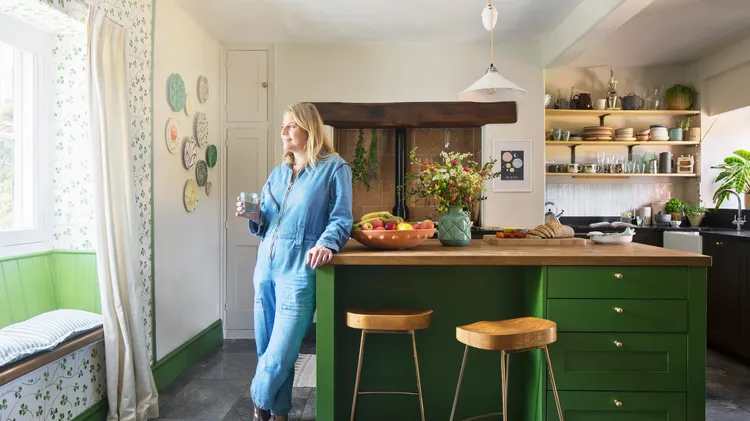
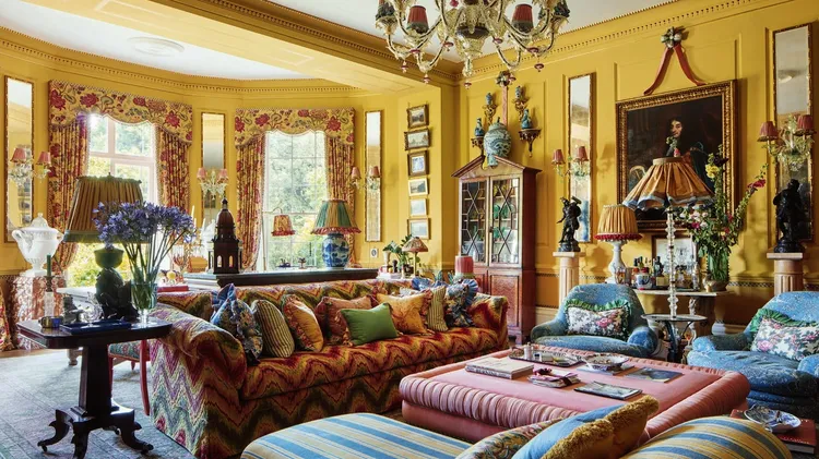
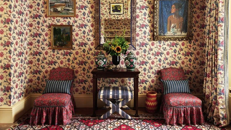
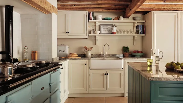
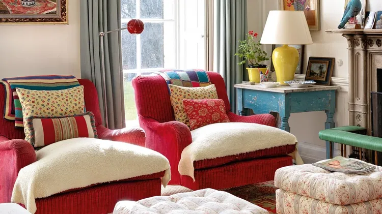
‘this cottage is telling our story’
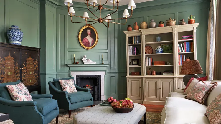
In the process of updating her 18th-century home, this owner found herself unexpectedly drawn to bright patterns and lively colours, bringing warmth and joy into the hubbub of their cosy family space