Europe
Asia
Oceania
Americas
Africa
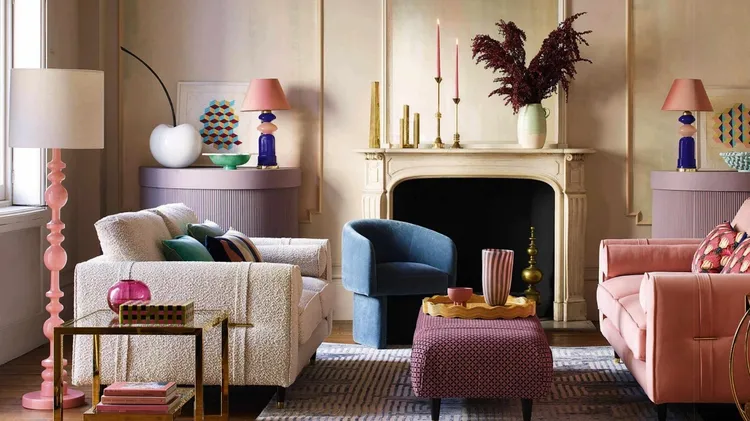
USE COLOURS THAT MAKE YOU HAPPY, SAYS HEATHER YOUNG
My go-
1 DON’T FORGET THE FIFTH WALL The concept ...
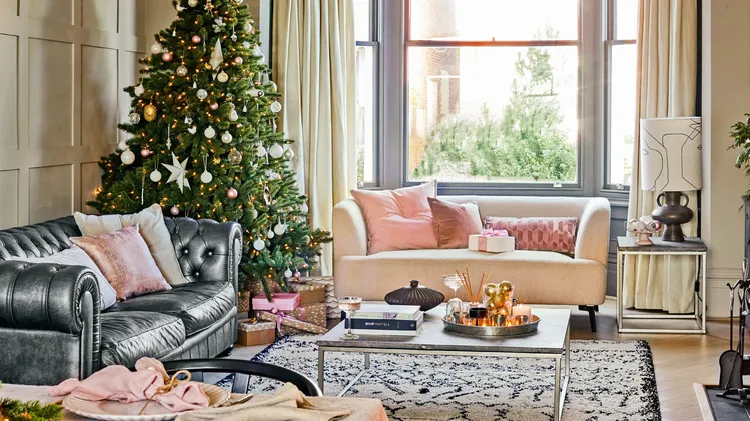
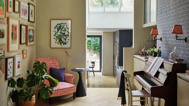
Nicky Aldridge has given this Victorian townhouse a fresh new look that’s full of style and sparkle
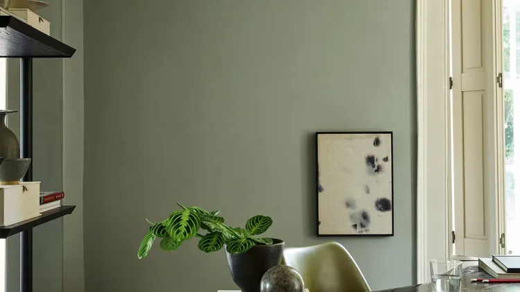
CREATE A GROUNDING AND PEACEFUL ROOM SCHEME WITH THIS SOOTHING SHADE
Whether you’re tackling a room makeover or a complete home renovation, it can be daunting trying to make decisions to create a space that meets your needs for both style and functionality. To ensure a
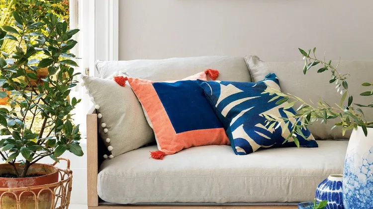
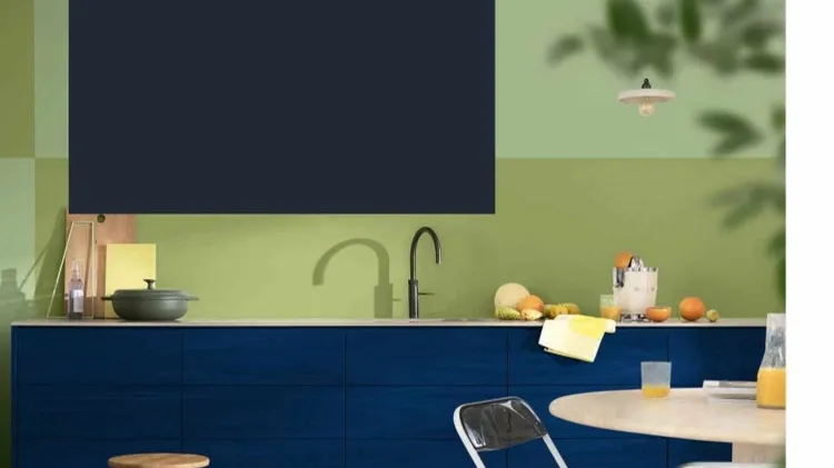
When Dulux named its Colour of the Year 2026 as not just one, but three shades of blue, we fell in love with the colour all over again. The three hues, united in a family called Rhythm of Blues, are c
From a window seat overlooking the garden to a cosy hobby room, a personal retreat creates an inviting and relaxing place to take time for oneself. ‘We’ve seen a growing desire for creative sanctuarie