Europe
Asia
Oceania
Americas
Africa
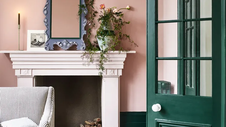
IH COLOUR EDIT
THIS MONTH, OUR COLOUR EXPERTS PRESENT A FRESH TAKE ON TH
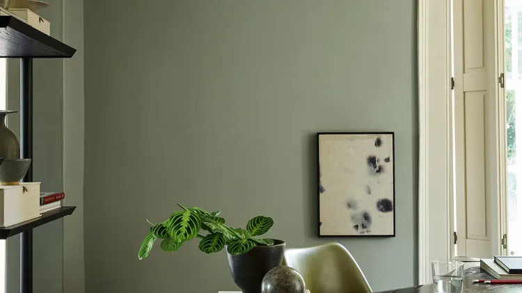
CREATE A GROUNDING AND PEACEFUL ROOM SCHEME WITH THIS SOOTHING SHADE
CLEVER TRICKS TO MINI DECOR PROJECTS… WE ROUND UP THE SIMPLEST, QUICKEST WAYS TO MAKE YOUR HOME MORE BEAUTIFUL NOW
1 DON’T FORGET THE FIFTH WALL The concept ...
Nicky Aldridge has given this Victorian townhouse a fresh new look that’s full of style and sparkle
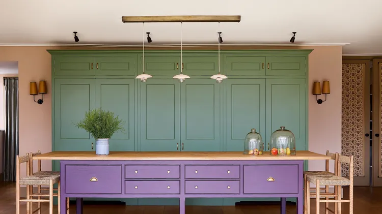
This 1980s home was yearning for vibrancy and Laura Stephens delivered that with the most beautiful palette
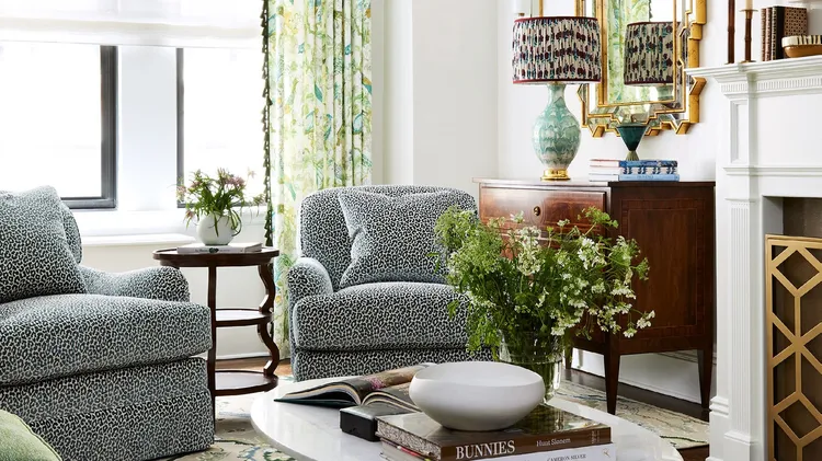
Designer Lisa Frantz reveals how she transformed this formerly dark Park Avenue pre-war apartment into a stunning and light-filled family home