Europe
Asia
Oceania
Americas
Africa
Photoshop
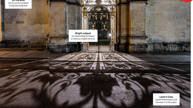
Turn composition chaos into actionable s
This month: Improve composition Compose yourself for photographs that are worth looking at more than once
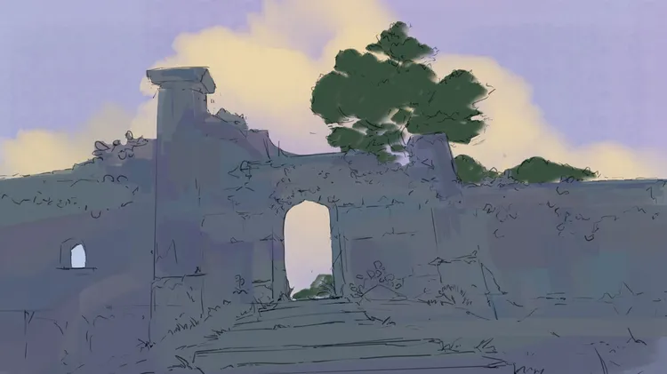
Concept artist Killian Prevost on how to build matte paintings, from composition to colour
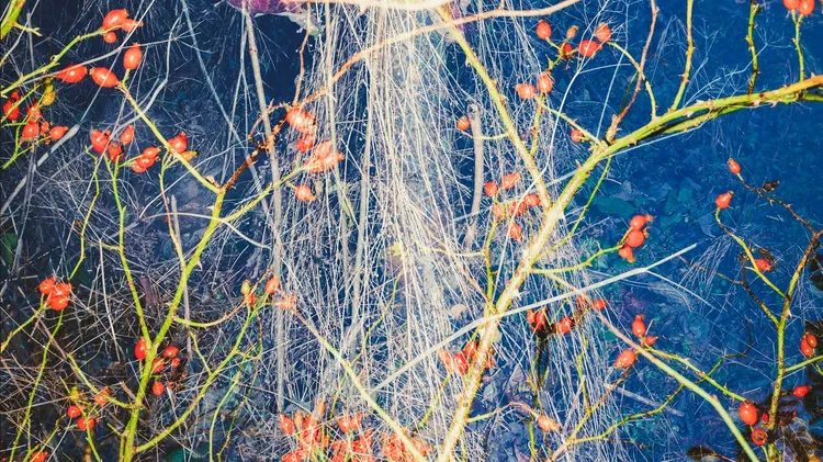
Benedict Brain searches his archives for the inspiration to escape winter’s creative doldrum
Dan Mold explains how to add this effect to your images using Photoshop or Elements
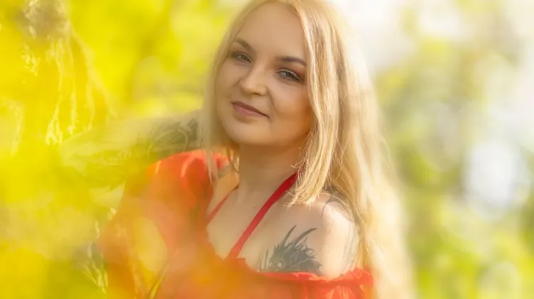
Master creative use of long exposure to capture the dynamics of nature, says Karolina Konsur
Rob Redman shows you how you can take your 3D camera and use it add character to your renders