Europe
Asia
Oceania
Americas
Africa
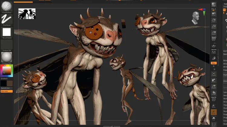
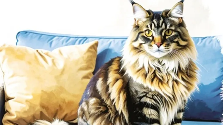
The concept artist gives us an insight on the portraits of pets and people from
Traditional skills, Photoshop, ZBrush & Blender
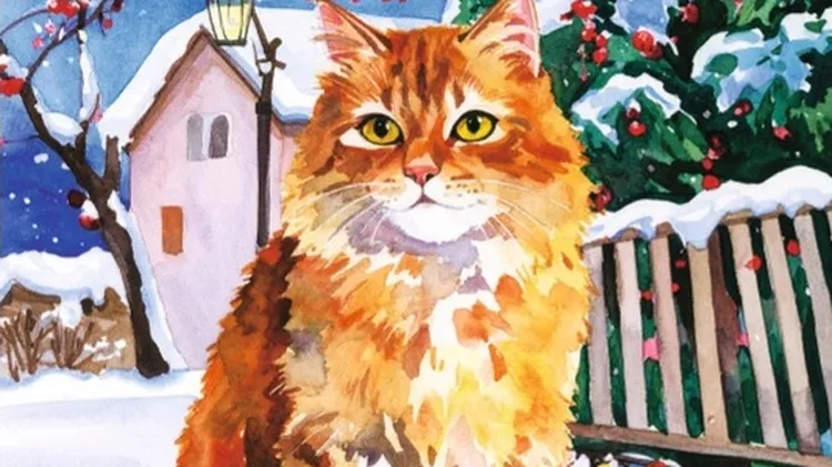
Lauren was no art expert – but she knew what she liked
WE nearly owned a cat once. He caused something of a neighbourhood dispute, too. My other half advised keeping our heads down because of it, but I really couldn’t do that when pegging out the washing.
Spotlight on readers’ excellent images and how they captured them
A s I write this, just a week before Christmas, it’s a wonderfully frantic time in the office as we sign off magazines and race to meet deadlines, all in the hope of enjoying a well-deserved rest over
DINNER time, Duncan!” I call, setting down a dish of the expensive cat food the vet recommended on the kitchen floor. Duncan trots in, sniffs it suspiciously, gives me one of his disdainful stares and