Europe
Asia
Oceania
Americas
Africa
In depth Cohesive colours
Clip Studio Paint & Photosh
Lightroom has a range of tools for the task, says Sean McCormack
Photo Filters are used for colour correction, but combined with Blending modes, they are a versatile tool, says James Abbott
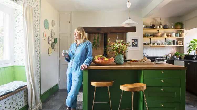
In the process of updating her 18th-century home, this owner found herself unexpectedly drawn to bright patterns and lively colours, bringing warmth and joy into the hubbub of their cosy family space
Wendy Evans explains how to create disintegrating portraits with the help of Affinity Photo 2’s brushes, layer masks and Mesh tool
Dan Mold explains how to give your photos extra punch and grit, using layers in Photoshop
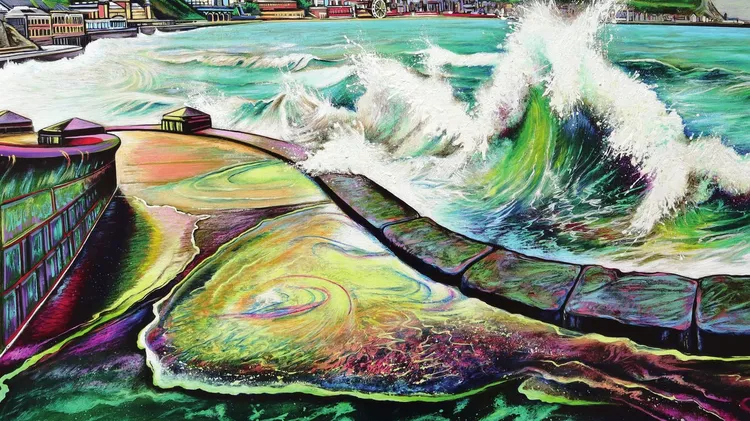
I LOVE TO WATCH A ROUGH SEA, especially in winter. There is something mesmerising about the rhythmic movement. This sheer power rejuvenates the mind, filling you with awe – it is uplifting and almost