The conversation

3 min read

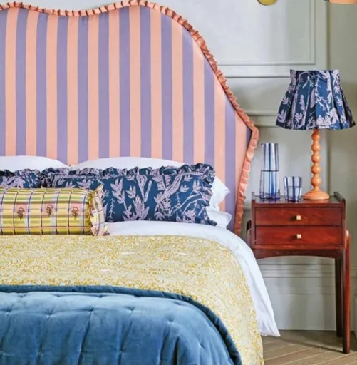
Designer Kelly Hoppen is famed for championing neutrals but, as she tells our editor Pip R ich, there are a few new tricks to stop beige ever seeming boring

Kelly Hoppen has designed homes for some of the biggest stars in the world, from Victoria Beckham to P. Diddy. She is credited with constantly reinventing how to use neutrals, and her most recent project is collaborating with Celebrity Cruises on their new Celebrity Beyond ship.

PIP RICH Kelly! Last time we spoke was at your London home and I was marvelling then at all the little tricks you’d used to make a neutral scheme seem lively – essentially what you’re known for. I am going to assume the answer is yes, but I take it you’re still into neutrals?

KELLY HOPPEN I’m very lucky in that my jobs are all around the world. I’ve got 42 projects on the go right now and I’ll slip from an Indochine design moment in Vietnam to doing P. Diddy’s home in LA. I’m like Mrs Doubtfire, I’m always dipping in and out of all these fantasy moments.

But the similarities are that everyone always wants their spaces to make them feel good, to allow them to have an experience, rather than to get caught up looking at each individual item in a room. So, yes, neutrals are the easiest way to do this.

PR Taupes, beiges and whites have a wonderful ability to be dressed up or down, in a way, to be soothing or enlivening depending on how you style them. But I said at a reader event recently that I strongly believe beige is back and everyone laughed!

KH People have been laughing for 43 years, but beige has never left us. Think of it as the perfect base colour, like when you’re putting on make-up. You apply it first, then layer other things on top. It’s ideal for this.

PR What shades are you into layering on top at the moment?

KH I really like yellow and pops of red. Emerald greens and whites and then black for the floors. In a recent project in Sydney I used poured resin for the floor with inlays of gold strips – it looked a little like an earthquake and was so beautiful. I’m using cork a lot, and I’m tending to use a lot of blonde woods as the perfect base layer, then playing with eras when it comes to what goes into the room. A modern red chair or footstool and then an old tapestry on the wall.

PR I really like yellow too. Not a shade I’d ever have gone for a couple of years back, but now I have a yellow sofa. It plays into the mood I think people are after now, of a home that always feels like a holiday. I’m trying to design a space in which I can walk barefoot, in which I can sit on cool linens, in which there always seems to be a source of light. Not so easy in the UK but yellow works well for this.

KH Yes. And to increase the feeling of light, don’t cover windows! The British are k

This article is from...

Related Articles

Related Articles