Europe
Asia
Oceania
Americas
Africa
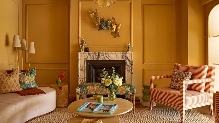
WARM AND INVITING, THIS GOLDEN PALETTE IS CREATING SOMETHING OF A BUZZ
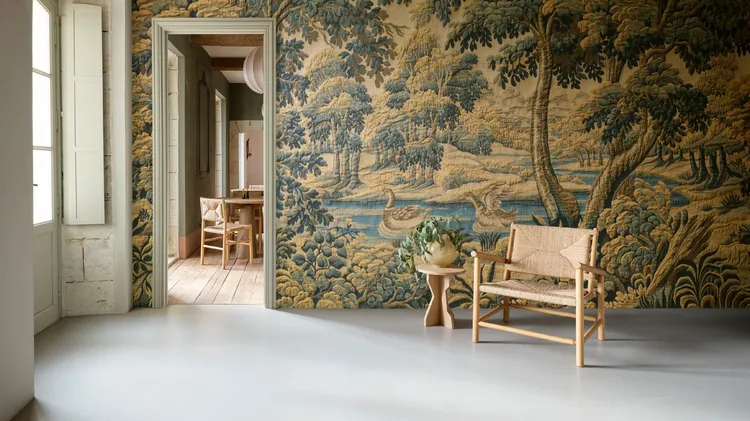
MAKING BEAUTIFUL SPACES FOR JOYFUL LIVING
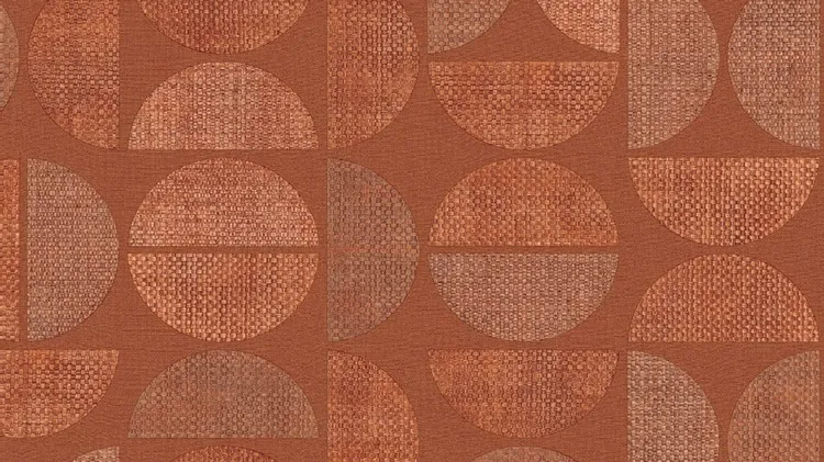
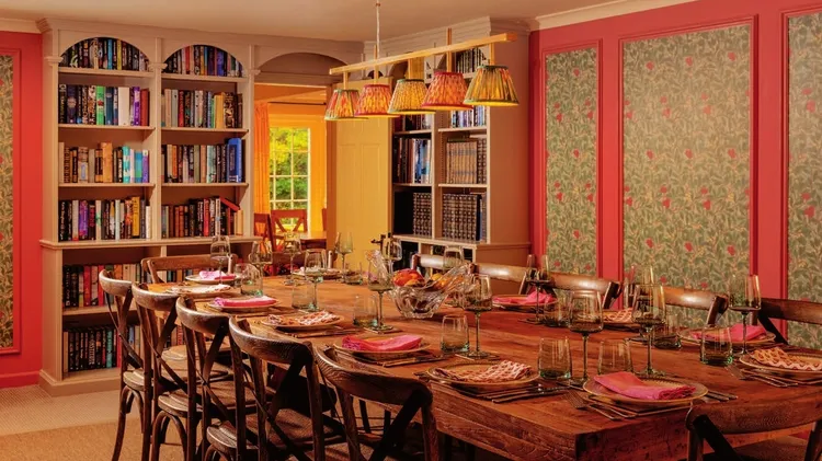
MORE TEXTURE! MORE COLOUR! MORE PATTERN! Bella Evennett-Watts EXPLORES THE VERSATILITY OF VERTICAL DESIGN
Sunny yellows, sassy stripes, cloudscapes and even butterflies – this London home is designed to raise a smile
Consider your home an invitation to play with the rainbow
Ideas to suit all tastes and to create a space that is truly luxurious
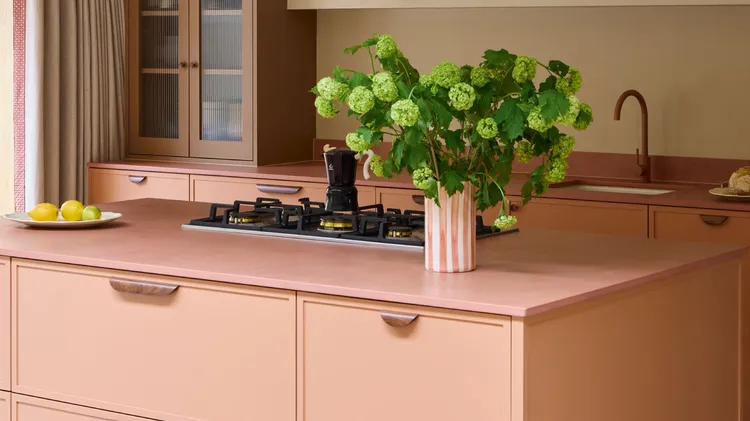
Of all the ways to decorate, paint is probably amongst the most powerful of tools. It can significantly alter the mood of a room, creating a calming, uplifting or cocooning effect, serve as the founda