Europe
Asia
Oceania
Americas
Africa
The varied and vibrant hues of South Beach have informed a delightful look for
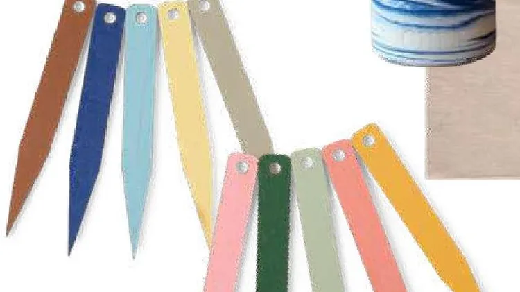
Consider your home an invitation to play with the rainbow
BEAT THE BLUES BY DECORATING YOUR HOME WITH THESE PRO RECOMMENDED, PICK ME UP SHADES
Refresh your home for spring with our pick of the latest interiors trends
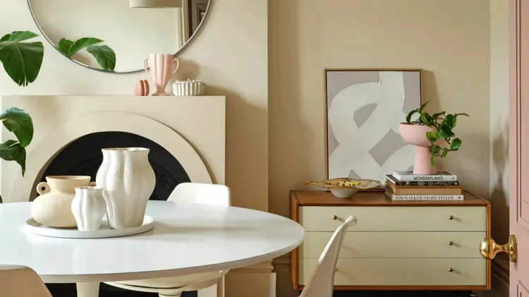
Warm, uplifting and endlessly liveable with, sheer yellow is a joyful way to bring some spring sunshine indoors, without going too bright. Working as a centre ground between beige and bolder yellow sh
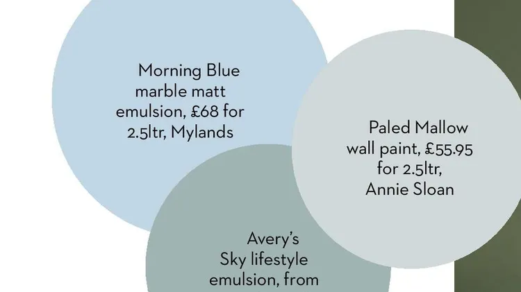
Of all the ways to decorate, paint is probably amongst the most powerful of tools. It can significantly alter the mood of a room, creating a calming, uplifting or cocooning effect, serve as the founda
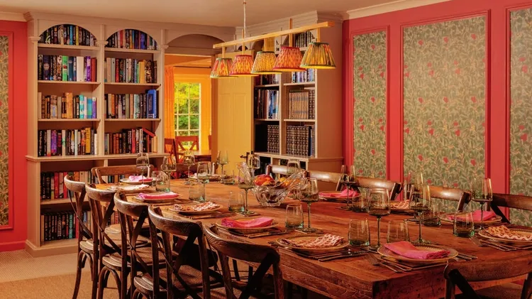
Sleep in a bed of roses by swapping tired sheets for fresh floral designs. This year’s botanical patterns feel especially romantic, as trending wildflowers bring a traditional countryside charm. For t