Europe
Asia
Oceania
Americas
Africa
Colour report
Deep, dark burgundy and aubergine are having an interiors
The rest is history To mark its ...
There’s no better time than a bank holiday weekend to dive into some DIY and tackle those time-heavy tasks you’ve been putting off! With an extra day to play with, you can pace yourself, enjoy the tea
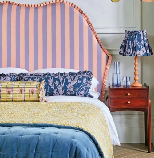
Interiors inspired by places near and far will always result in schemes that are richly layered and tell a story
Think of a classic cottage garden and you’ll likely bring to mind a naturalistic and romantic design with soft shapes, bold blooms, and a sweet heady fragrance in the air. The great news is, no matter
There’s a quiet yet palpable energy as you wander around Margate on the Kent coast. It’s a feeling perhaps not dissimilar to what it must have felt like in the 1730s when this little-known Tudor fishi
Childhood memories of her mum’s baking inspired Rebecca Honeywell-Ward to launch Honeywell Bakes, which makes giftworthy biscuits and baking kits with a sustainable focus. These fanciful creations are from her book, Planet Friendly Baking