The greatoutdoors

9 min read

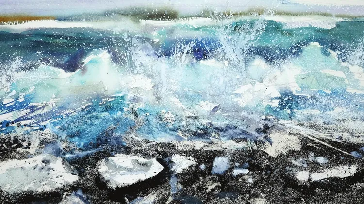
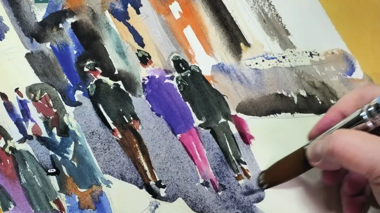
Maria Rose shows you how to energise your working practice and learn how to capture the colour and atmosphere of your subject when working en plein air

View Over Watermouth Harbour, oil on board, 11¾x15¾in (30x40cm)

Painting outdoors is a way for me to connect with nature, light and my surroundings and to truly see my subject. The act of trying to capture a moment transcends my busy mind. For that hour or two, I simply paint and respond. It is my preferred way to work, as I simply love being outside!

There are many fundamentals to consider when painting en plein air but probably none of them elicit quite the emotional response that colour does. Colour is one of the main reasons it is advantageous to paint from life rather than from a photo or sketch. Tone, composition, drawing and surface are all important to consider in a painting but for me, it is colour that is the main hook.

For this demonstration painting, below, I knew I wanted to make the most of the winter light, which was creating strong blues and mauves and quite a high-key colour palette. I returned to a spot I have painted before. The strong but simple coastal composition faces north east and, lit by the glancing afternoon sun, resulted in the most saturated colour, with an interesting interplay between light and shadowed areas.

I worked on a 9½x11¾in (24x30cm) MDF panel primed with Michael Harding non-absorbent acrylic primer and a toned ground of warm grey acrylic. This size panel makes it possible to complete a painting alla prima in around one-and-a-half hours, by which time the scene will have changed too much to continue.

My palette of colours, below, is the same for whichever subject I am painting and I very rarely stray from this. This simplicity and familiarity helps with intuitive colour mixing when you are painting en plein air, which is important when time is of the essence. It is what I describe as an ‘organised palette’ rather than the reduced palette favoured by some plein-air painters. It’s a happy compromise between quick-and-easy colour mixes without being too overwhelming and unwieldy. I have the standard warm and cool of each primary, plus white and then a few earths and premixed greens for their use in mixing.

▲ A folding palette helps to transport your leftover paint easily at the end of the session. I try to keep good palette discipline but it can be a bit of a mess by the end of the painting! You can see I have generally tried to keep lighter values at the top, darker at the bottom, warmer colours on the right and coole