Ready for your close-up?

5 min read

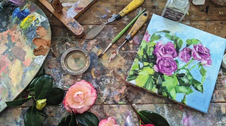
CHER PRUYS is a self-taught artist who works in different mediums. Here, she describes the thought process that goes into her portrait painting ▸

Flashback 1960 is an example of the sibling connection. This is my sister and me – I’m the small one – in the matching bathing suits our mother insisted we wear. This continued until the teen years, when we spent a number of years, like most siblings – especially sisters – refusing to acknowledge our family connection!

I choose my subjects carefully to engage my audience – and also to share a story. Usually, I like to take numerous photos of them from many angles. Even though these differ from my chosen pose for the final composition, I find this allows me to get to know the person well and to form a connection with them. I prefer natural light when I take photos as I feel it has a much softer look. I believe that lighting is of the utmost importance to a successful composition. Light evokes so many feelings and conveys emotion. I spent a lot of time understanding light and paying attention to how it affects what we see. My portraits vary in the light I portray, as they all have different moods and convey different messages, such as nostalgia, romance and even emptiness. To tell a story that engrosses viewers is a driving factor in the portraits I like to paint, as this lends itself to the piece becoming one that leaves a lasting impression.

Once I have decided on the right perspective for a subject, I begin to sketch on 300lb hot press paper; it’s so smooth and perfect for high detail. It is a bit unforgiving, but worth it for achieving the desired results. Accuracy in my subjects’ features is essential for the hyper realistic results that I find desirable. The sketching is the most important – as well as the most demanding – part of my process, taking countless hours to create a drawing that is highly detailed with an undeniable exactness.

Once I am satisfied with my sketch, I pick my palette. Keeping in mind that colour conveys meaning by sight, like sound does to the ear, I choose wisely. This comes into play with the background especially, where the right colours can add depth and symbolism to my work. Blue shades, for example, can add a tranquil feeling; red a glow of passion and green a refreshing aura. There are rules for choosing colours in painting, such as the 60-30-10 rule which states that 60% of your artwork should be a dominant colour, 30% should be the secondary colour or texture and the last 10% an accent. Howeve