Europe
Asia
Oceania
Americas
Africa
Present your data as interesting graphs and colorful charts in Numbe
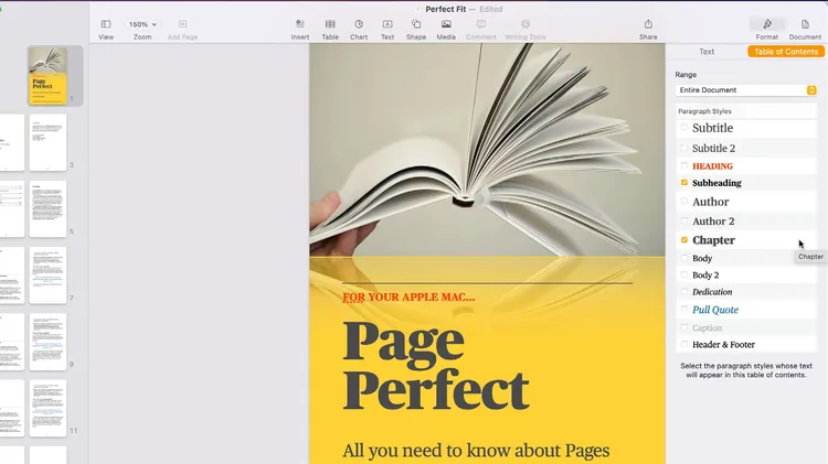
Take the time to see what Pages for Mac really has to offer
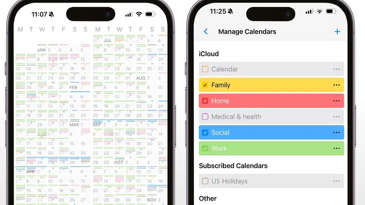
Take control of your time by having the next 12 months at your fingertips
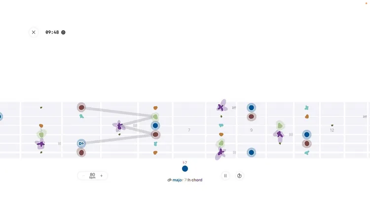
NoSheet feels like a game but trains your brain to recognise notes
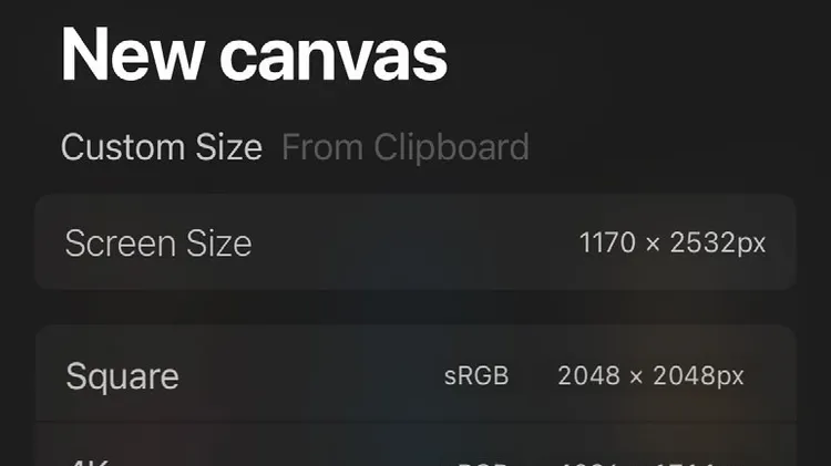
Unleash your inner creative wherever you are
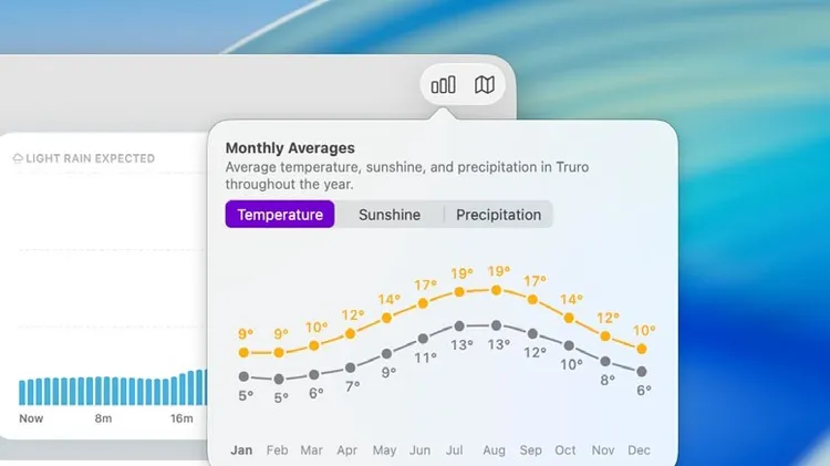
Be prepared for any eventuality when you step outside your door
An ongoing dispute about format compatibility. No, don’t turn the page – it’s more interesting than it sounds. Yes, because it goes to the heart of who owns what in technology, and has major implicati